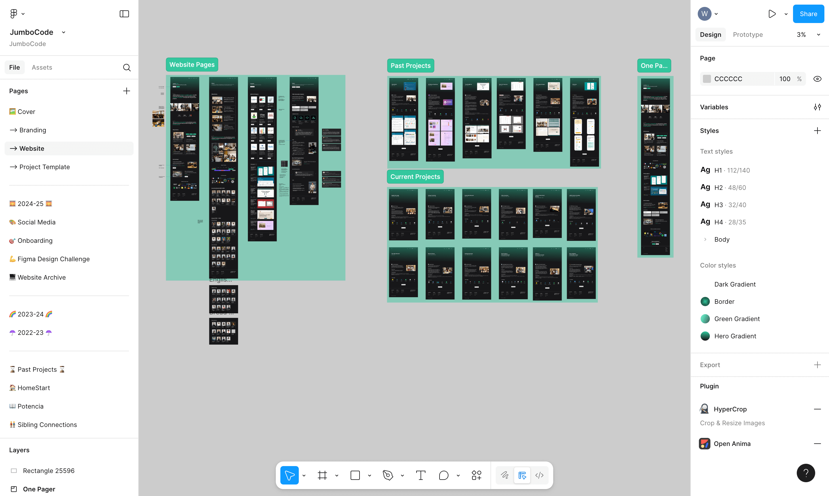
Prototypes
We restructured the site around new information architecture
The old website buried critical details. I created a new content hierarchy to ensure prospective students and nonprofits could easily find what they needed.
Jul 2024 - Feb 2025 · Shipped
Mentored 12 UX designers building web apps for nonprofits and rebuilt the club's online presence, increasing applications by 35%.
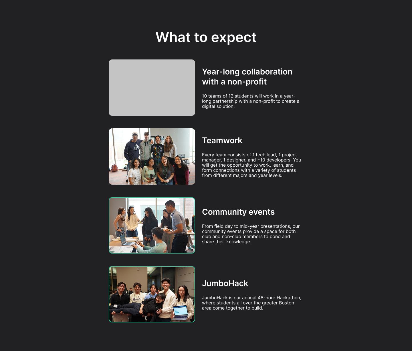
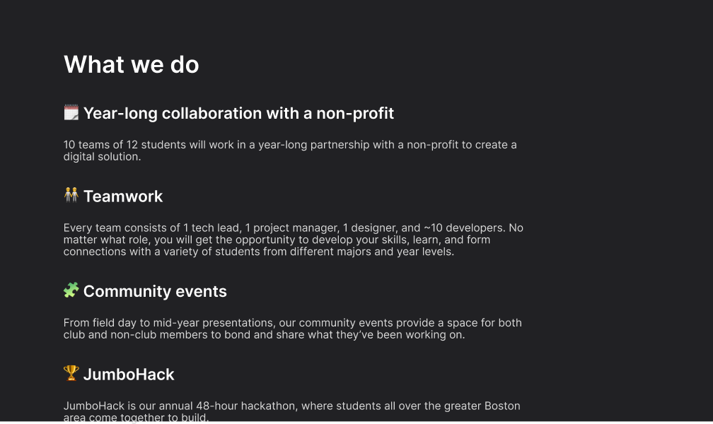
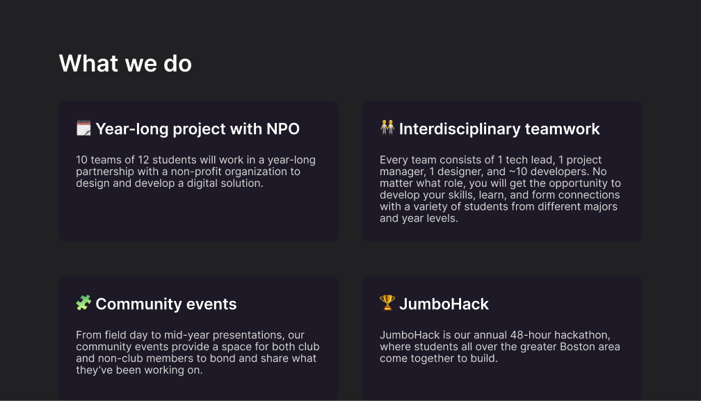
JumboCode is a student-run digital agency at Tufts University that builds free software for nonprofits, with over 175 annual members and 75 shipped web apps. The old club website didn’t reflect JumboCode’s work quality or effectively attract prospective students and nonprofits so I initiated a redesign and built a new site alongside fellow board members.
Increased student applications by 35%
Created and documented the first scalable design system
Implemented 15 case studies, 8 testimonials, and 150+ photos
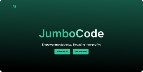
Before: lacks key details and social proof
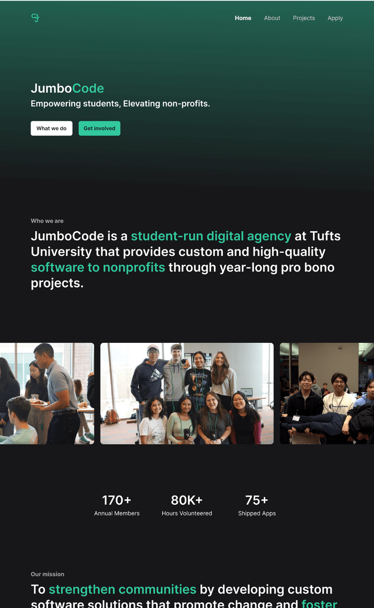
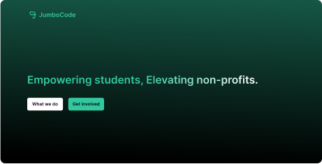
After: informs and encourages applications
There wasn’t enough information about what the club did, how to get involved, or outcomes from past projects. JumboCode needs high interest from Tufts students and nonprofits to sustain 12 annual web app projects and over 175 members, yet the club website was unfinished.

Projects lacked goals, outcomes, and interface designs
Difficult for users to gauge project quality
Place holder text made the club look unprofessional
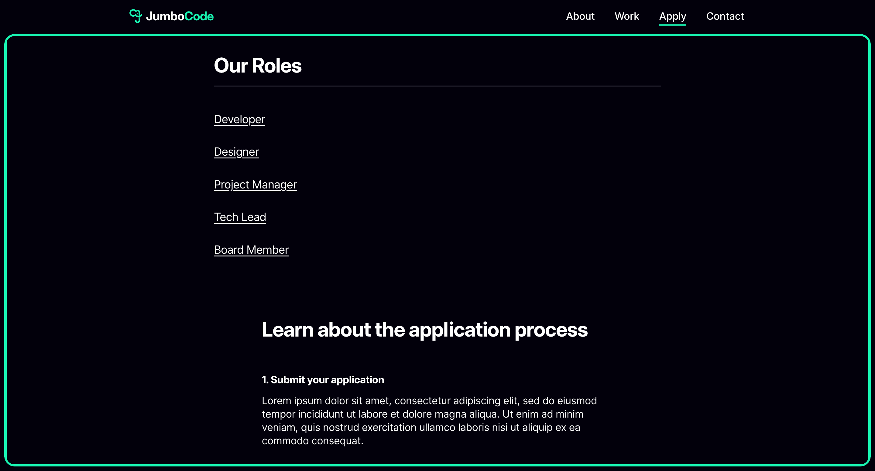
Application process was scattered across multiple pages
We focused on adding social proof and specific details about our annual projects to encourage applications. It was also important to build something club members could be proud of.
The updated platform supports JumboCode's mission to create free software for Boston nonprofits by drawing more members and clients. I led the redesign from end-to-end and created the first documented design system, supporting developers through sprints and contributing to a 35% increase in student applications.
Check out the full site here!
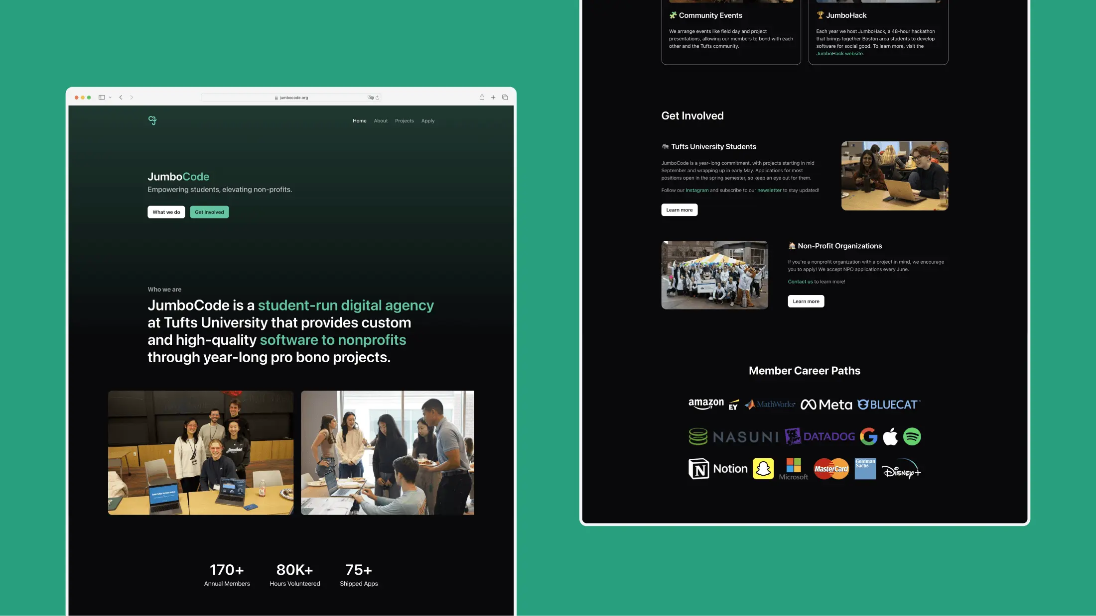
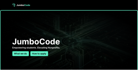
A modern platform with 4.5x more content and refreshed branding that clearly explains our mission and gives visitors the context to understand our work.
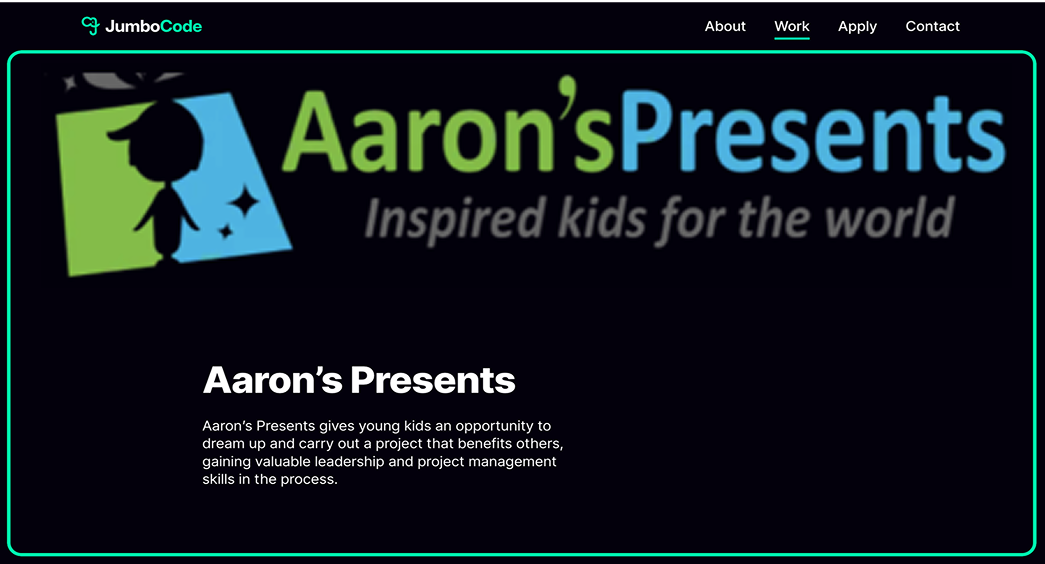
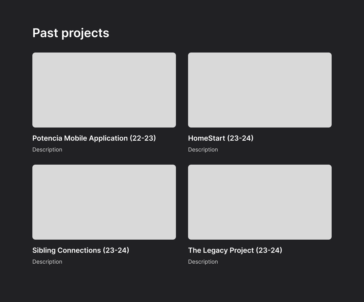
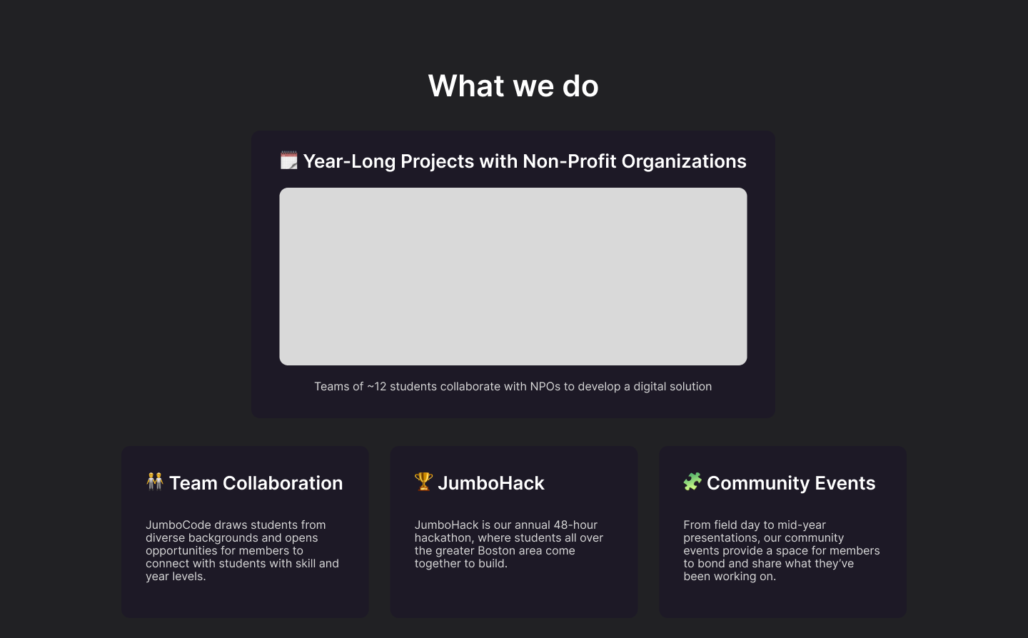
A selection of projects that tell complete stories through goals, outcomes, and final UI screens, building credibility and trust with nonprofits.
An application flow with clear roles and timelines to simplify applying and drive a 35% increase in student applications.
Research
We spoke with students, nonprofit clients, and club members to understand what information was missing and what would have helped them when they first discovered the club. Later, we validated our near-final designs through informal usability tests, pulling key quotes and insights.
"I couldn't tell what JumboCode did or how to join"
"The site felt so old and incomplete that I didn't show it to people"
"The project page made me unsure what the work looked like"
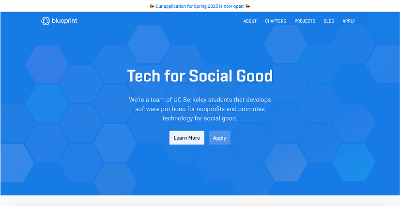
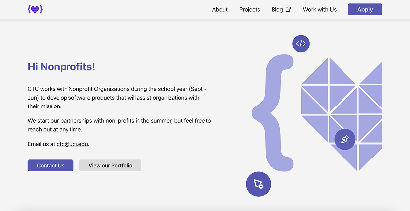
We analyzed peer organizations like Blueprint and Commit the Change, borrowing effective patterns around structure, impact metrics, and community storytelling to inform our own site direction.

Mission first hero with one clear line that guides visitors

Consistent navigation patterns drives user discovery and builds trust

Addresses nonprofits directly and encourgaes them to reach out

Proof of work lives in a PDF portfolio
Prototypes
The old website buried critical details. I created a new content hierarchy to ensure prospective students and nonprofits could easily find what they needed.
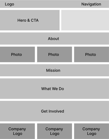
Home
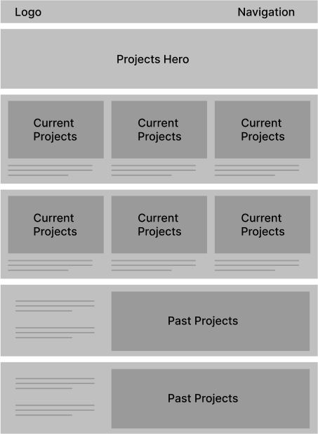
Projects
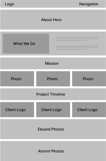
About
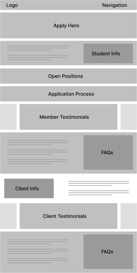
Apply
Through testing, many early designs were set aside. Below is a 'graveyard' of unused home and about page sections showcasing some of our design explorations.
Design
After rounds of iteration, we landed on a design that communicated JumboCode's mission clearly while also showcasing its people and impact in a more engaging way.
Before
After
I built JumboCode's first design system and created a dedicated Figma file for the club. This streamlined developer handoff and left future members with a structured foundation to build on.