Led the Redesign of JumboCode’s Website Driving a 35% Increase in Student Applications
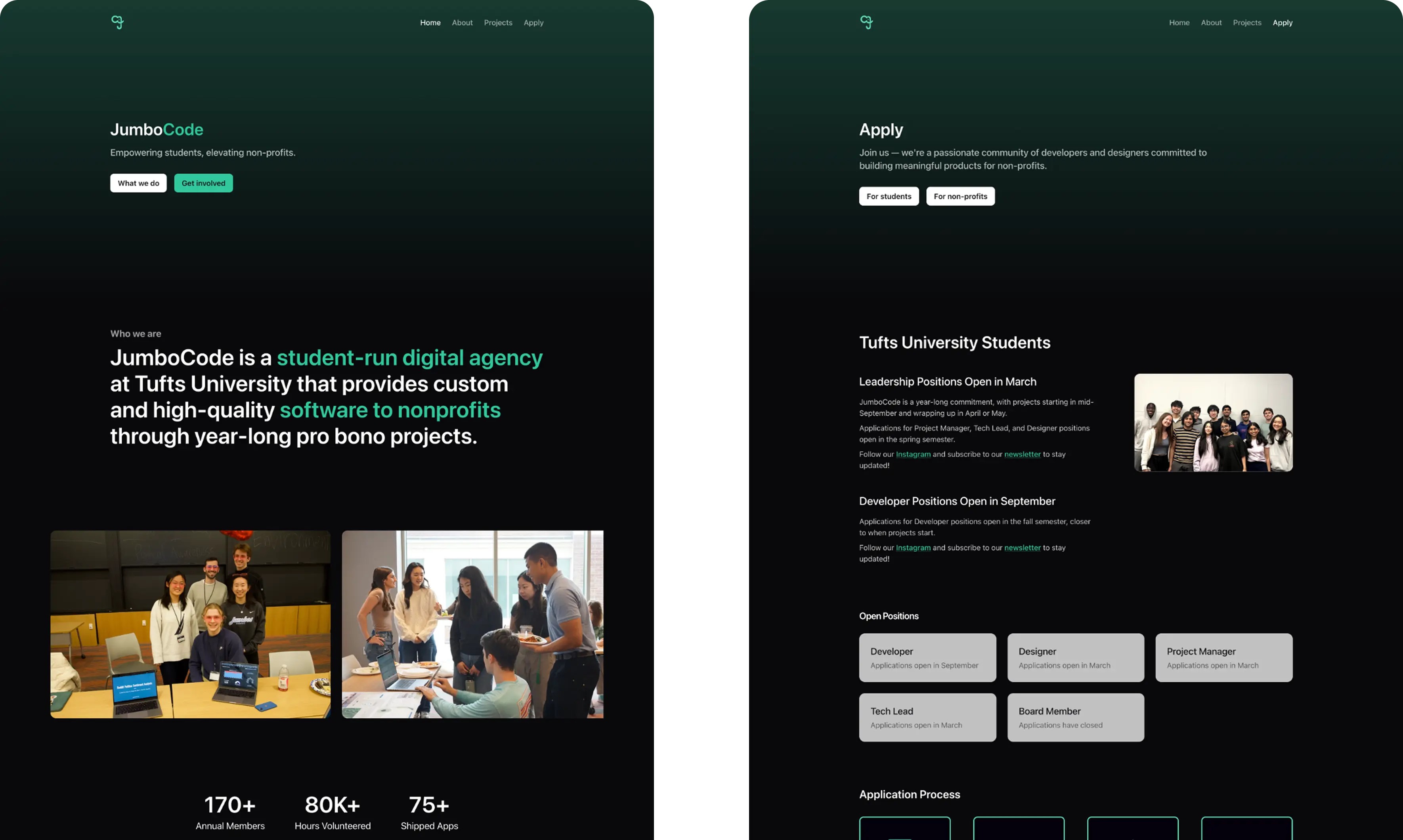
JumboCode is a student-run digital agency at Tufts that builds free software for nonprofits, with 175+ members and 75+ shipped apps. As Head of Design, I led the full website rebuild through reseach, design, and implementation.
Visit Site →35%
Increase in student applications
(2023 vs 2024)
4.5x
Growth in case study content
(old site vs new)
1
Design system for handoff
(no prior documentation)
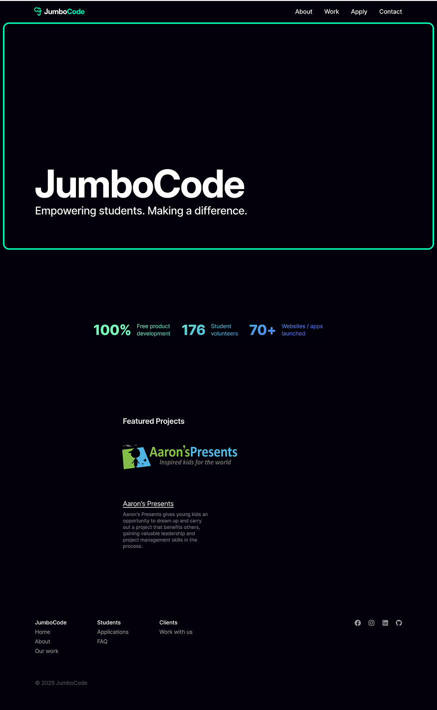
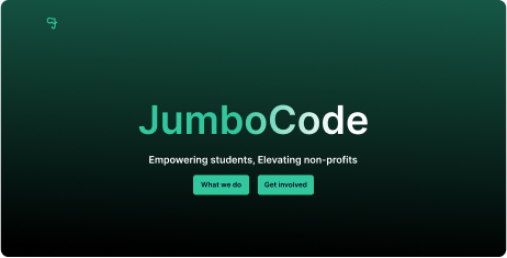
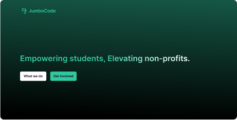
Before
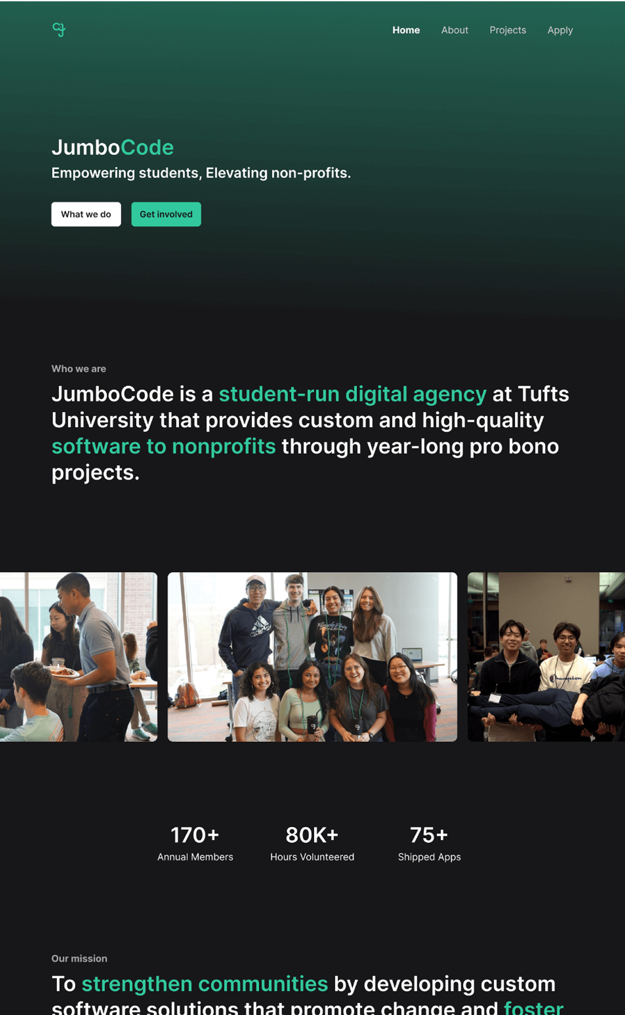
After
Problem
The old website left students unsure how to join and nonprofits uncertain on what we offered, threatening JumboCode's ability to grow and sustain 12 annual web app projects.
Unclear what JumboCode does
Users couldn't tell that we build free software for nonprofits or why it mattered
Missing proof of impact
Project entries lacked details like final screens and results, hurting user trust
Lack of application details
Scattered roles and steps left students and nonprofits confused about applying
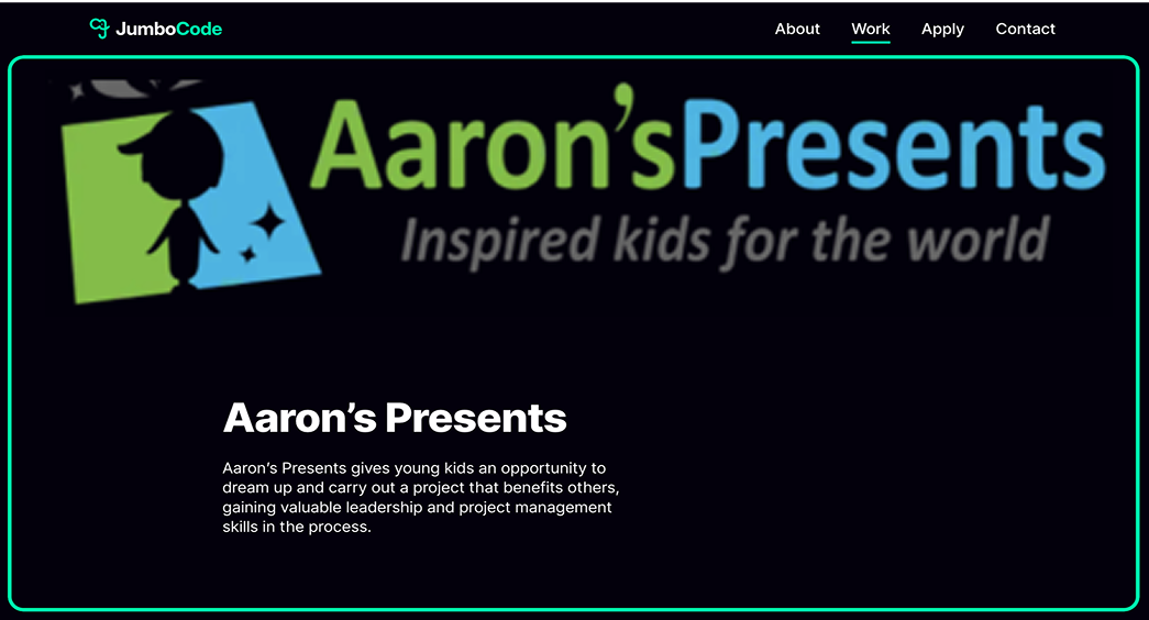
Each project only showed a title and short blurb, leaving out goals, outcomes, and final deliverables
Without UI screenshots, projects felt incomplete and failed to showcase web app quality
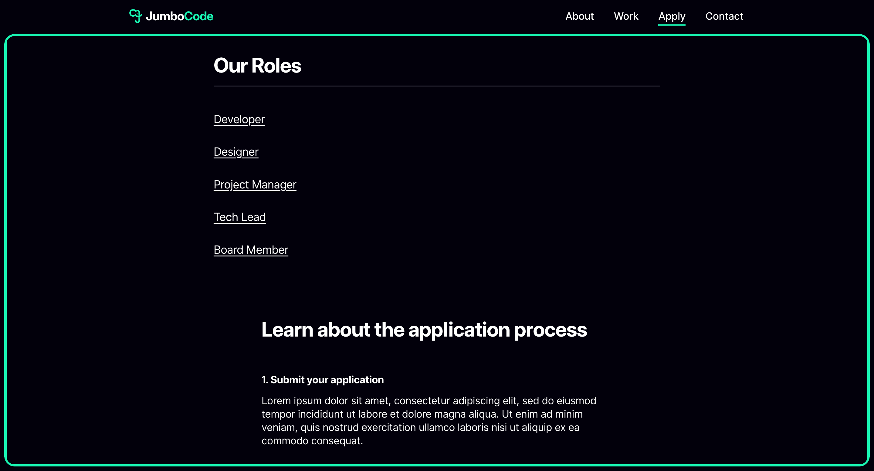
Application process was unclear and scattered across multiple pages
Lorem ipsum text signaled an unfinished site, making the club look less professional
Goal
How might we design a website that explains what JumboCode does, builds confidence through our projects, and makes applying simple for students and nonprofits.
Make it obvious we build free software for nonprofits
Showcase project outcomes and final screens to build user trust
Present roles, timelines, and steps to make applying easy
Solution
The new JumboCode website provides a modern platform that better represents our work and community. I supported the dev team across coding sprints and oversaw the final execution to ensure the site launched smoothly, leading to a 35% increase in student applications.
Check out the full site here!
01 - Homepage
Making our mission clear from the first scroll
A modern platform with 4.5x more content and refreshed branding that clearly explains our mission and gives visitors the context to understand our work.
02 - Project Page
Showcasing projects with proof of impact
A selection of projects that tell complete stories through goals, outcomes, and final UI screens, building credibility and trust with nonprofits.
03 - Apply Page
Streamlining applications for students and nonprofits
An application flow with clear roles and timelines to simplify applying and drive a 35% increase in student applications.
Process
📝Research
Users wanted clarity on what JumboCode actually does
We spoke with students, nonprofit clients, and club members to understand what information was missing and what would have helped them when they first discovered the club. Later, we validated our near-final designs through informal usability tests, pulling key quotes and insights.
Tufts Sophomore
"I couldn't really tell what JumboCode did or how I was supposed to join"
JumboCode PM
"The site felt so old and incomplete that I didn't even want to show it to people"
Nonprofit Client
"The project page made me unsure about what the final work would look like"
Other university clubs highlighted gaps in our content
We analyzed peer organizations like Blueprint and Commit the Change, borrowing effective patterns around structure, impact metrics, and community storytelling to inform our own site direction.
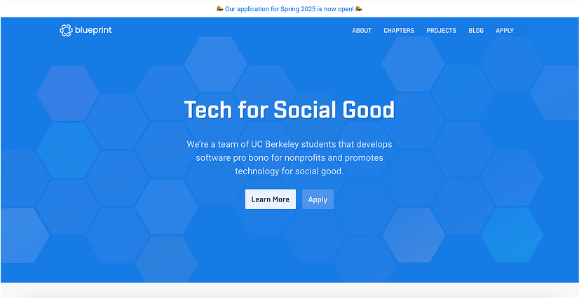
Mission first hero with one clear line that orients visitors and drives action
Clear navigation and consistent page patterns drives user discovery and builds trust
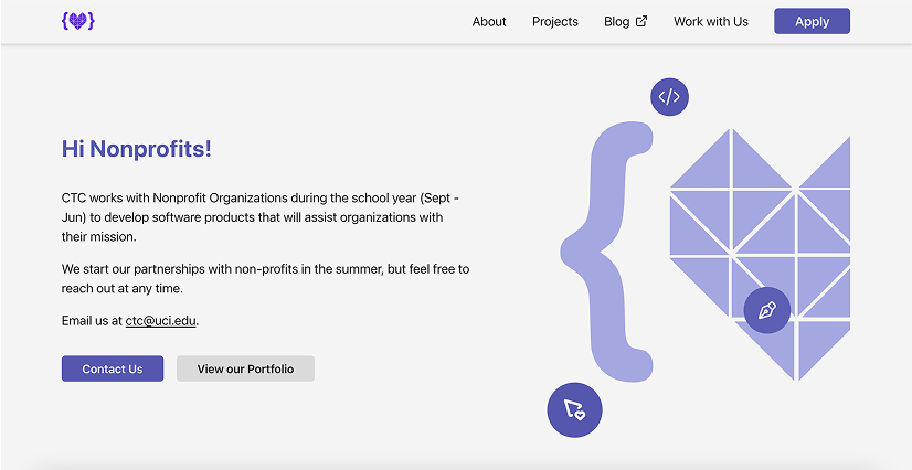
Speaks to nonprofits directly and highlights the next step, lowering friction to reach out
Proof of work lives in a PDF portfolio, easy to share but difficult to scan for outcomes
🛠️ Prototypes
We restructured the site around a clear information architecture
The old website buried critical details. I created a new content hierarchy to ensure prospective students and nonprofits could easily find what they needed.
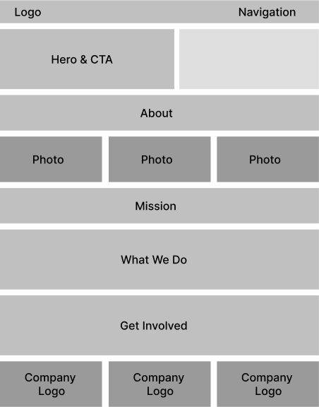
Home Page
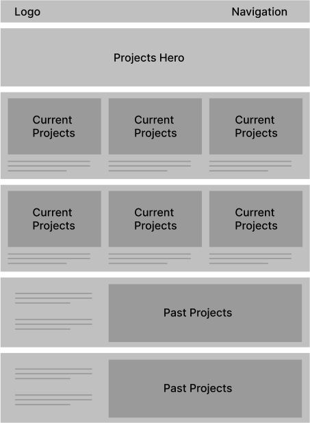
Projects Page
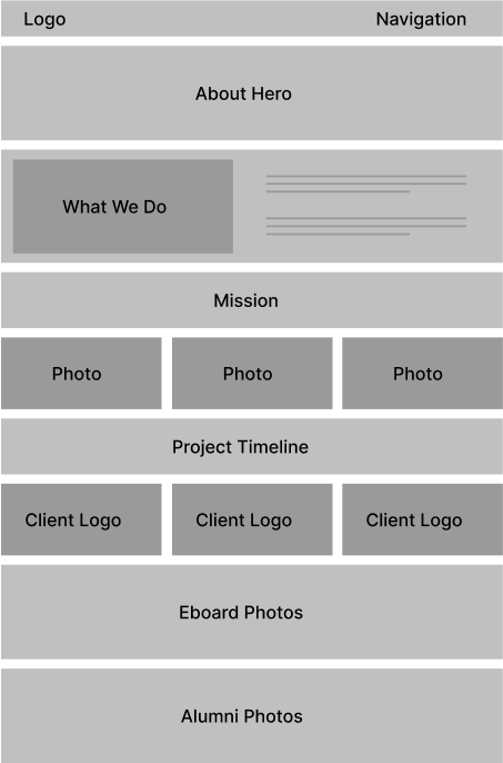
About Page
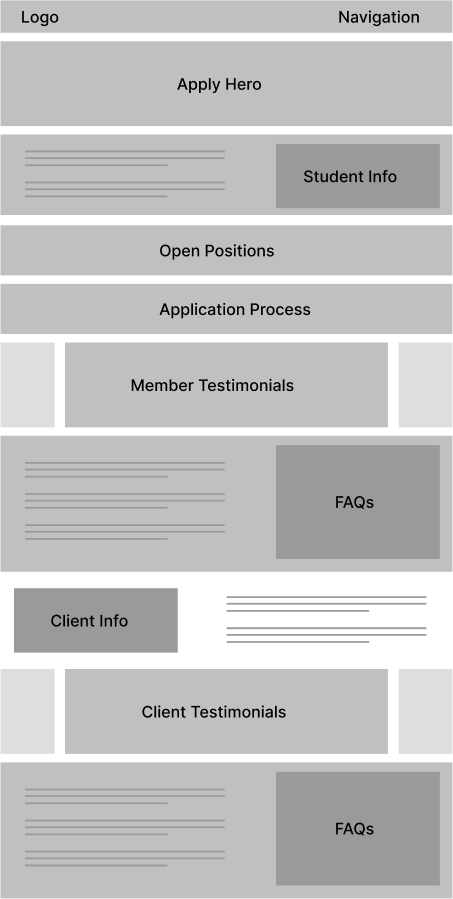
Apply Page
Iteration revealed what didn’t work (and why)
Through testing, many early designs were set aside. Below is a 'graveyard' of unused home and about page sections showcasing some of our design explorations.
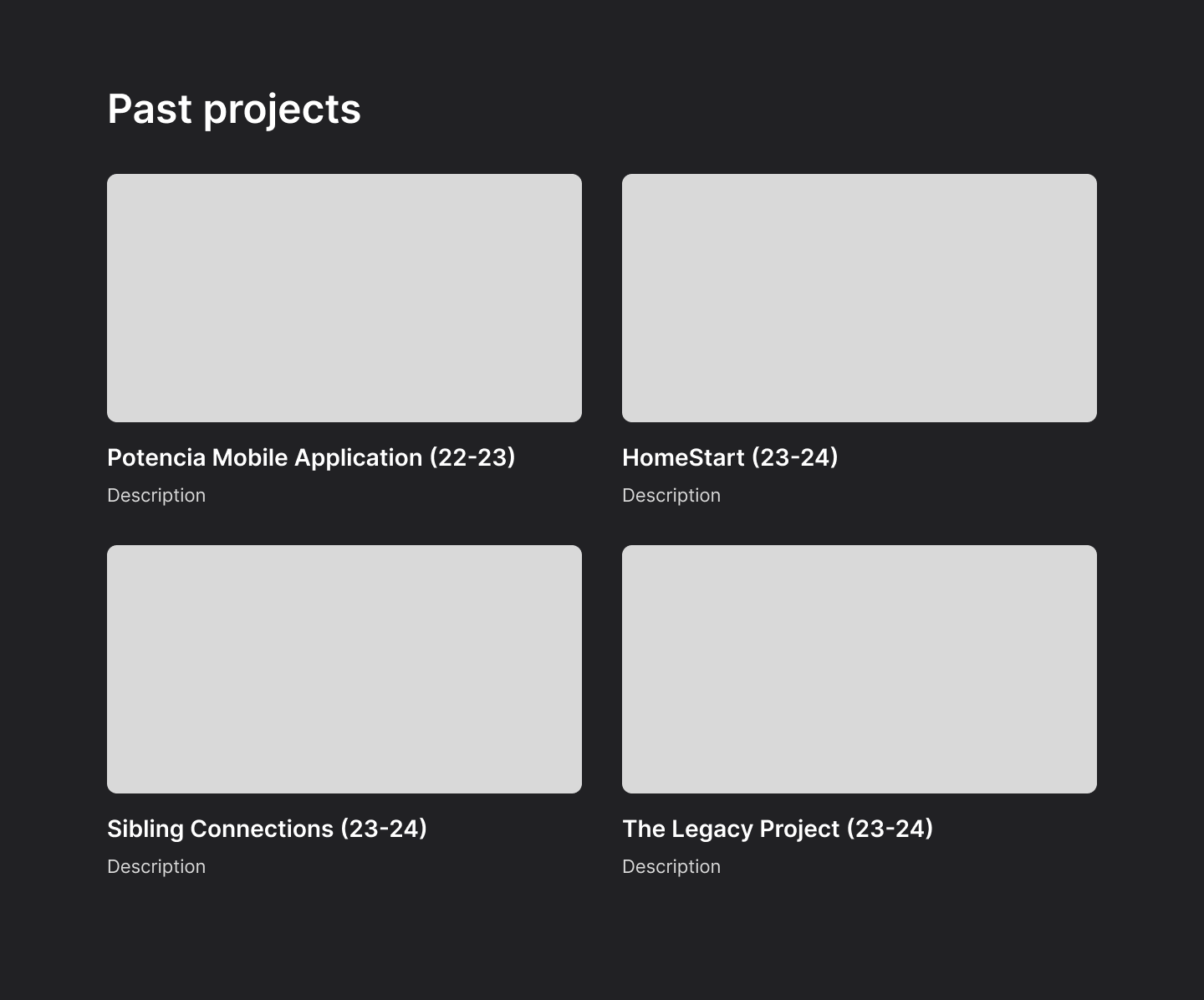
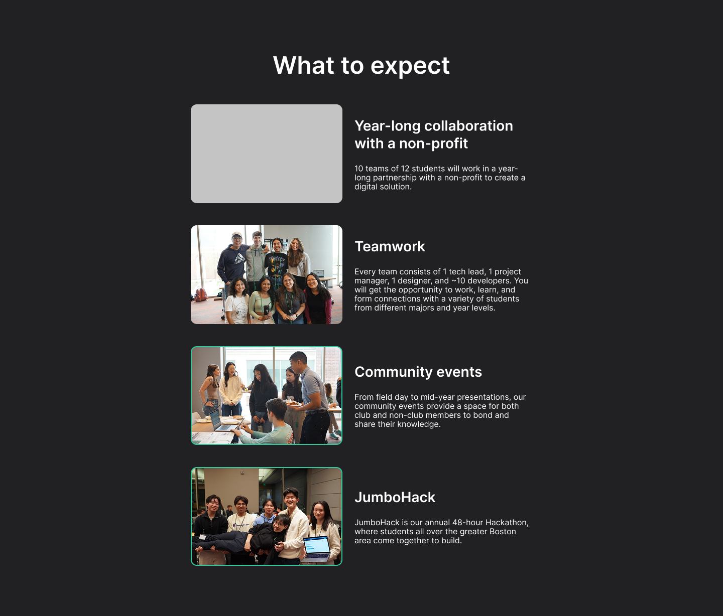
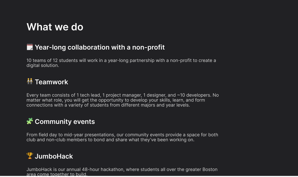
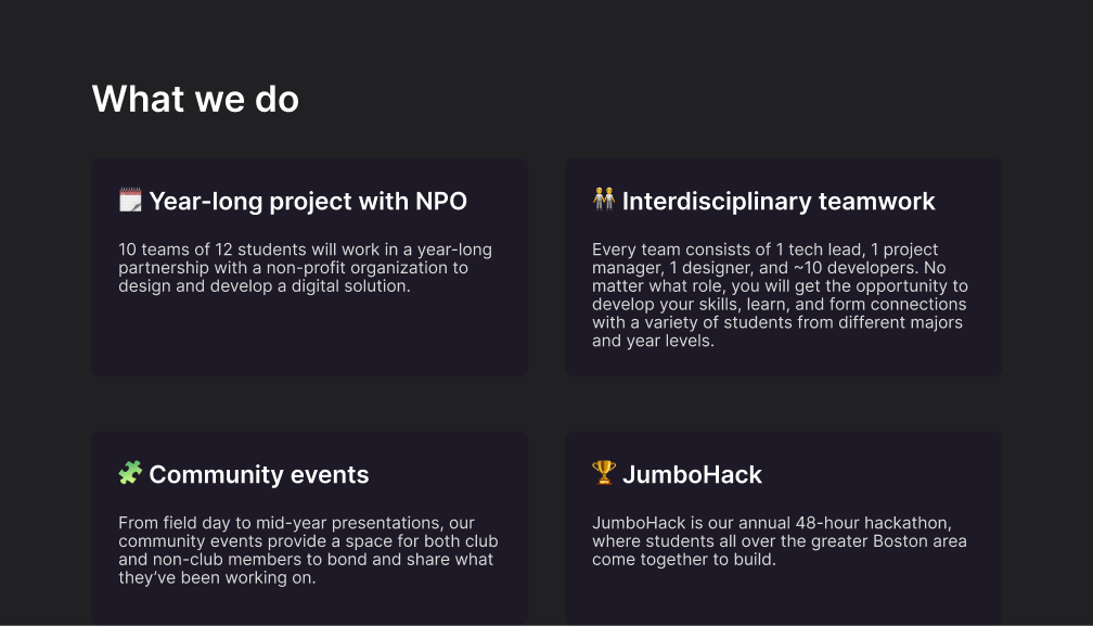

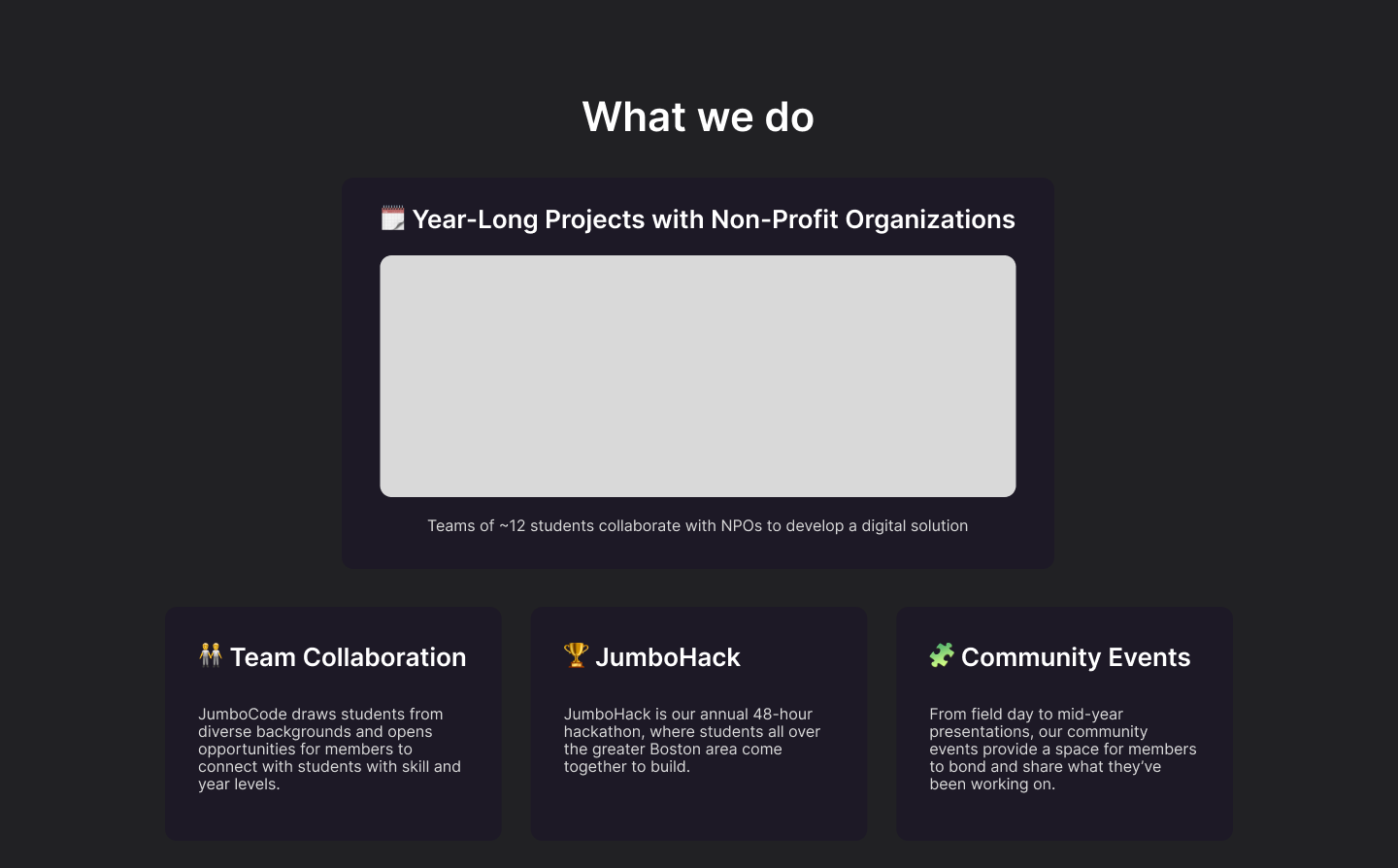
🎨 Design
We chose a design direction that balanced visuals with clarity
After rounds of iteration, we landed on a design that communicated JumboCode's mission clearly while also showcasing its people and impact in a more engaging way.
Before

After

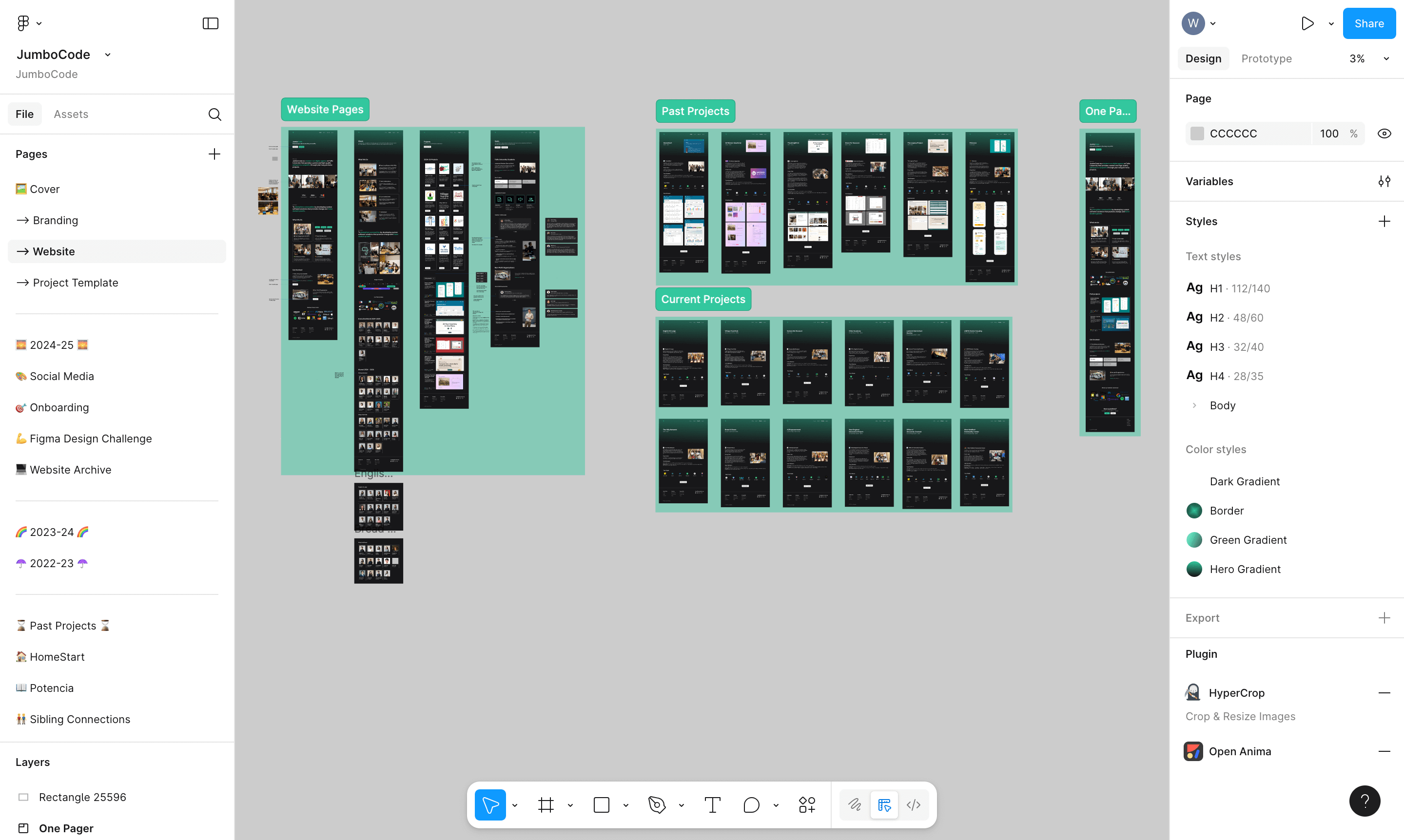
A design system ensured smooth handoff and lasting impact
I built JumboCode's first design system and created a dedicated Figma file for the club. This streamlined developer handoff and left future members with a structured foundation to build on.
35%
Increase in student applications
(2023 vs 2024)
4.5x
Growth in case study content
(old site vs new)
1
Design system for handoff
(no prior documentation)


